The New XSplit (Logo)
We have a new logo!
Everyone knows and loves the old logo, it’s iconic and has been with us since 2014 so why change it, you might be asking? Aside from naturally wanting aesthetic improvements, a lot has changed with XSplit since that time. Our overall focus has gradually shifted especially during the last couple of years with newly-released products and some upcoming ones.
Fun fact: Not many people know that XSplit wasn’t originally created with gamers in mind. When the first XSplit product was launched in 2009, it was more of a productivity suite aimed at helping people share content with others in the form of screenshots, short videos with annotations, etc.
Long story short, XSplit Broadcaster eventually became widely known as a live streaming and recording software that was embraced by gamers, and the rest was history. While the previous logos were not super explicit, they still communicated content creation and sharing throughout its evolution.

The last logo stayed for a while undergoing minor revisions. Our product portfolio began to grow to the point where XSplit was no longer just about Broadcaster. Our markets had expanded outside of gaming and content creation. Last year was the pinnacle when the interest in XSplit VCam skyrocketed as more and more people worked from home. Other people have started using XSplit Broadcaster as well for other purposes like online meetings and webinars.
We’ve come full circle, once again serving the productivity and the general workforce market. And while gaming will always continue to be ingrained in our identity, the need for tools and applications that will help people face the ‘new normal’ has been stronger than ever, and we know we can deliver!
At this point, we know there’s no delaying the inevitable, and the time is now to reveal our new logo (unless you’ve seen it at the top there, but hey, we like to build suspense).
The new XSplit
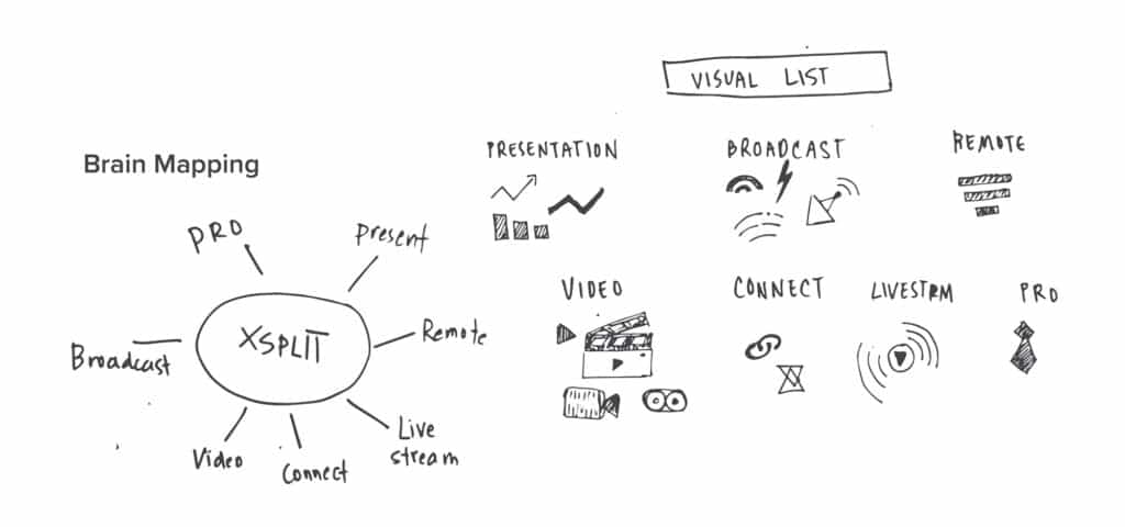
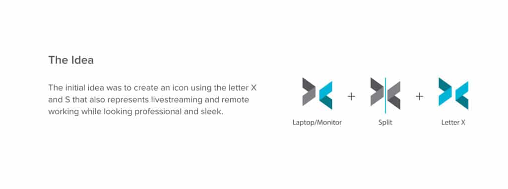
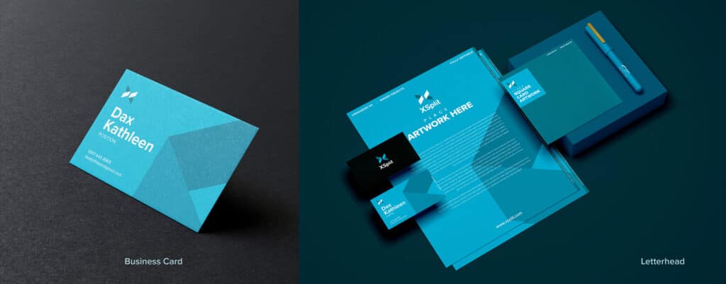
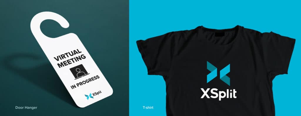
This new logo better encapsulates, thanks to the work of our designer Diana Chanco, what and where we are as a brand and slots in nicely with our existing and future products. More importantly, it looks more refined and flexible to scale easily in various applications which cannot be always said with our old logo.
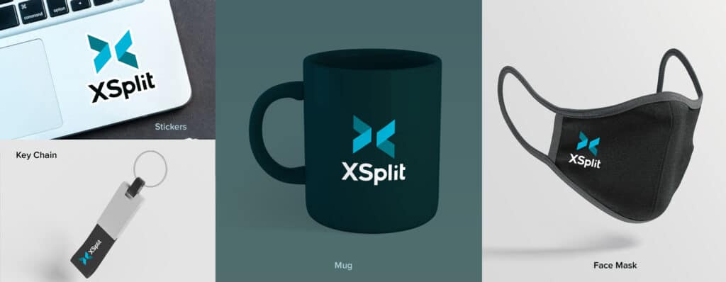
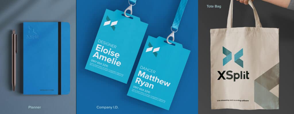
In addition, we will be retiring SplitmediaLabs corporate website and consolidating all communications, updates, and job postings through the XSplit brand. Be sure to stay tuned for more updates in 2021! We hope you like it.
